# Chart
Source: https://docs.quillsql.com/components/chart
The Chart view of a Quill Report
```tsx App.tsx
import { QuillProvider, Chart } from "@quillsql/react";
const MyChart = () => (
);
```
A simple component that displays the given data in one of many chart types.
Make sure `QuillProvider` is a parent of the `Chart` component.
### Automatically fetch data by id
If you know the id of the chart you would like to display, you can pass in the reportId to the Chart component and it will load and display the data for that chart.
```jsx
import { QuillProvider, Chart } from "@quillsql/react";
function App() {
return (
);
}
```
### Pass data directly into the chart
Alternatively, if you have the actual data you would like to display (eg. you fetched the data using our `useQuill` hook) you can also pass in a `QuillReport` directly to the Chart component and it will display that data without async fetching.
```jsx
import { QuillProvider, Chart } from "@quillsql/react";
function App() {
const report = useQuill("664283fb4db8ad000bfe54d7");
return (
);
}
```
## Props
The chart id. The most usage is through a detail page built to navigate from
the dashboard - using the onClick callback to get the reportId, and
navigating to a route (say, reports/:id) where the url param is passed in as
the reportId. For a standalone table, you can find the reportId in the Quill
Portal and pass it in directly.
When config is passed, the chart will not refetch the given report and will
instead simply render the report it was given.
A `config` must be passed if `reportId` is not present.
A report to render, if any.
When a reportId is passed, the chart will first fetch the data necessary to
render this chart, and then it will render the report that it receives from
the server.
See the API Reference for a `QuillReport` [here](/components/dashboard#quill-report).
A `reportId` must be passed if `config` is not present.
A list of color strings used to color the chart.
For example, a pie chart would use the colors for each section and a bar
chart would use the colors for each bar.
Whether to show animations on render complete.
Whether to hide the x axis.
Whether to hide the y axis.
Whether to hide the cartesian grid lines.
Whether the date range filter should be hidden.
Whether to hide the horizontal cartesian grid lines.
Whether to hide the vertical cartesian grid lines.
Whether to hide the all but the first of the X-Axis ticks.
Whether the cartesian grid lines show as dashed or solid.
The color of cartesian grid lines.
Whether the comparison range shows as dashed for date comparison line charts
(as opposed to the default solid line).
An optional function that takes a report and theme and returns a map of keys
used in that report to the colors they should use.
The color values support RGB hexcodes and CSS color literals.
```js
function mapColorsToFields(report, theme): ColorMapType {
return {
amount: {
primary: 'red',
comparison: 'gray',
primaryGradientStart: 'red',
primaryGradientStop: 'lightred',
comparisonGradientStart: '#EFEFEF',
comparisonGradientStop: '#EFEFEF00',
},
total: {
primary: 'red'
},
};
}
```
### ColorMapType
```ts
export type ColorMapType = {
[field: string]: {
primary: string;
comparison?: string;
primaryGradientStart?: string;
primaryGradientStop?: string;
comparisonGradientStart?: string;
comparisonGradientStop?: string;
};
}
```
Styles the top-level container of the Chart.
This can be useful for TailwindCSS-style classname strings.
The CSS styles that wrap the chart.
# Dashboard
Source: https://docs.quillsql.com/components/dashboard
A list of Quill Reports grouped into Metrics, Charts, and Tables.
```tsx App.tsx
import { QuillProvider, Dashboard } from "@quillsql/react";
function App() {
return (
);
}
```
Dynamically displays a filterable grid of charts, metrics, and tables with live
data from your database. Once implemented, Quill lets you perform zero-downtime,
zero-code updates to your dashboard on an org-level as well as company-wide.
Make sure `QuillProvider` is a parent of the `Dashboard` component.
Don't have a dashboard name yet? Learn how to [create a
dashboard](https://docs.quillsql.com/portal/chart) in the Quill portal to get
started.
## Examples
[![Edit \[Ant Design\] Quill React Components](https://codesandbox.io/static/img/play-codesandbox.svg)](https://codesandbox.io/p/devbox/ant-design-quill-react-components-9qcs8k?embed=1)
```tsx
import { Dashboard } from "@quillsql/react";
import { AntDateRangePickerComponent } from "./ui/ant/DateRangePickerComponent";
import { AntTableComponent } from "./ui/ant/TableComponent";
import { AntSelectComponent } from "./ui/ant/SelectComponent";
import { AntChartComponent } from "./ui/ant/ChartComponent";
import { AntMetricComponent } from "./ui/ant/MetricComponent";
export function AntDashboard() {
return (
);
}
```
[![Edit \[Material Design\] Quill React Components](https://codesandbox.io/static/img/play-codesandbox.svg)](https://codesandbox.io/p/devbox/material-design-quill-react-components-d862dk?embed=1)
```tsx
import { Dashboard } from "@quillsql/react";
import { MaterialDateRangePickerComponent } from "./ui/material/DateRangePickerComponent";
import { MaterialTableComponent } from "./ui/material/TableComponent";
import { MaterialSelectComponent } from "./ui/material/SelectComponent";
import { MaterialChartComponent } from "./ui/material/ChartComponent";
import { MaterialMetricComponent } from "./ui/material/MetricComponent";
import { MaterialFilterContainerComponent } from "./ui/material/Layout";
export function MaterialDashboard() {
return (
);
}
```
## Props
The name of the dashboard you created in the Quill Portal.
A component that wraps a report for 'metric' chart types.
The current report.
See the API Reference for a `QuillReport`
[here](/components/dashboard#quill-report).
A callback that should be fired when the user clicks on this report.
Whether this report is loading.
An error message that resulted from the loading of this report, if
any.
A component that wraps a report for non-metric, non-table chart types.
The current report.
See the API Reference for a `QuillReport` [here](/components/dashboard#quill-report).
A callback that should be fired when the user clicks on this report.
Whether this report is loading.
An error message that resulted from the loading of this report, if any.
The child of a chart component is a chart graph by default.
You can override this behavior by not passing children in your implemented
version and instead rendering your own Chart.
A component that wraps a report for 'table' chart types.
The current report.
See the API Reference for a `QuillReport` [here](/components/dashboard#quill-report).
A callback that should be fired when the user clicks on this
report.
Whether this report is loading.
An error message that resulted from the loading of this report, if any.
A select component.
 ```jsx Example
export function SelectComponent({ value, label, width, onChange, options }) {
return (
);
}
```
The value of the select element.
The width of the select element in pixels.
The label above the select element.
An event callback that is fired when the select value changes.
An array of value, label pairs which represent the select options.
A date range picker component.
The date preset.
The label above the date range picker.
The current date range.
A set of options to select presets from.
A callback that is fired when the selected date range changes.
An event callback that is fired when the preset value changes.
A component that wraps each dashboard section.
Each dashboard is grouped into three sections: metrics, charts, and tables
(in that order). Some sections may be empty, in which case they are omitted.
The name of the section.
The children of the dashboard section.
A component that wraps all dashboard sections.
The children of the dashboard section.
A component that wraps the row of dashboard filters.
The children of the filter container.
A fallback component displayed when an active dashboard has no reports.
Callback function that fires when a report is clicked. A common use
case is navigating to a new page based on the report's id. A dashboard is
composed of a list of reports that could be metrics, charts, or tables.
See the API Reference for a `QuillReport` [here](/components/dashboard#quill-report).
A callback that is fired when the loading status of the dashboard changes.
Whether to hide dashboard filters.
Whether the date range filters on the dashboard are hidden.
Whether to hide the xAxis for all charts on this dashboard.
Whether to hide the yAxis for all charts on this dashboard.
Whether to hide the cartesian grid for all charts on this dashboard.
The line style for comparison ranges on all line charts on this dashboard.
Applies the following classes to the ReportBuilder.
This container is the parent of all the filtering buttons as well as any
dashboard sections. This can be useful for TailwindCSS-style classname
strings.
The CSS styles that wrap the dashboard container.
This container is the parent of all the filtering buttons as well as any
dashboard sections.
The styles for the chart container.
## QuillReport
The report's unique id.
The name of the report.
The name of the dashboard this report belongs to.
The rows of data returned from this report's query.
The columns data returned from this report's query.
The type of this chart.
The table and field this chart uses for date filtering.
The pivot used in this query, if any.
The pivot title.
The aggregation type for the values in this pivot.
The row field.
The type of the row field.
The column field, if any.
The type of the column field, if any.
The value field, if any.
The type of the value field, if any.
The formatted primary range aggregation value, if any.
The formatted comparison range aggregation value, if any.
The percent change in the aggragations, if any.
The label of the xAxis.
The field to use for the report's xAxis.
The format for the report's xAxis.
A list of metadata bout the yAxes of this report.
The relative ordering of this report in relation to its siblings. Ordering
starts at 1 and counts up.
Reports in the same section are first grouped by `chartType` and then
each group is sorted by `order`.
Currently, the first group is `metric` and the last group is `table` with
the rest of the reports in between.
The rows of data returned from this report's query over the comparison date
range as opposed to the primary date range.
A map of filters that have been applied to this query.
# useFormat
Source: https://docs.quillsql.com/components/format
A simple way to format data from Quill
```tsx App.tsx
import { format } from "@quillsql/react";
function formatExample() {
format(123.45, "dollar_cents"); // "$123.45"
format(123, "dollar_cents"); // "$123.00"
}
```
The value of the thing being formatted.
The Quill format type of how you want to format the value.
# Quickstart
Source: https://docs.quillsql.com/components/quickstart
Add Quill to your app in less than a minute
### 1. Install dependencies
Install `@quillsql/react` using your favorite package manager:
```bash npm
npm install @quillsql/react
```
```bash yarn
yarn add @quillsql/react
```
```bash pnpm
pnpm add @quillsql/react
```
```bash bun
bun add @quillsql/react
```
### 2. Add QuillProvider
You connect Quill to React with the `QuillProvider` component. Similar to React's `Context.Provider`, `QuillProvider` wraps your React app and places Quill Client on the context, enabling you to access it from anywhere in your component tree.
In App.js, let's wrap our React app with an `QuillProvider`. We suggest putting the `QuillProvider` somewhere high in your app, above any component that might need to access Quill data.
```js App.js
import { QuillProvider } from "@quillsql/react";
import MyApp from "./MyApp";
function App() {
// Replace organizationId and publicKey with your values
return (
);
}
```
### 3. Add your first component
After your QuillProvider is hooked up, you can add Quill Components to your app. Let's start with the dashboard we created in the [portal tutorial](/portal).
You can find the dashboard **name** in the portal at [https://app.quill.co](https://app.quill.co).
Underlying queries and charts can be updated via the Quill Portal, and the
dashboard will render the newest version.
```js App.js
import { QuillProvider, Dashboard } from "@quillsql/react";
function MyDashboardPage() {
return ;
}
```
# QuillProvider
Source: https://docs.quillsql.com/components/quill-provider
A context provider that wraps all quill components
```tsx App.tsx
import { QuillProvider } from "@quillsql/react";
function App() {
return (
{children}
);
}
```
The quill provider allows all the quill components in your app to share
information which lets your dashboards render fast and update dynamically.
Similar to React's `Context.Provider`, `QuillProvider` wraps your React app
and places Quill Client on the context, enabling you to access it from
anywhere in your component tree. We suggest putting the QuillProvider
somewhere high in your app, above any component that might need to access
your quill data.
### With OrgId
If you're using the Quill Cloud, you can pass in your public key and the current
organizationId (if any) and the Quill Provider will automatically connect to the
hosted Quill Cloud.
```jsx With OrgId
{children}
```
### With QueryEndpoint
If you're self-hosting Quill, you can point the Quill Provider to the location
of the server running the Quill SDK. You may also pass a map of query headers
that will be forwarded to your server with every request Quill sends. This can
be useful if the `/quill` endpoint is behind a preexisting auth middleware.
```jsx With QueryEndpoint
{children}
```
## Props
The public Quill API key. This can be found in the Quill portal in the
"Settings" tab.
The environment this app is running in (eg. "production").
The tenant ids of the user. Required if not passing a queryEndpoint. If this
value is not passed in on the frontend, it should be passed in on the backend
if you are using a self-hosted server.
The url of your self-hosted server running the quill server SDK, if any.
Additional query headers passed along with all requests to the custom query
endpoint, if any.
Whether to include credentials with requests to the query endpoint.
A custom theme used throughout your dashboard.
The children of the provider. This is usually the rest of your app.
# ReportBuilder
Source: https://docs.quillsql.com/components/report-builder
A UI component for creating and editing Quill Reports
```tsx App.tsx
import { QuillProvider, ReportBuilder } from "@quillsql/react";
function App() {
return (
);
}
```
Allows non-technical users to build SQL queries using either UI or AI and
then edit them on the fly. Once users have constructed a query they like,
they can click a button and add that report to their dashboard or export it
as a CSV.
Make sure `QuillProvider` is a parent of the `ReportBuilder` component.
## Examples
[![Edit \[Ant Design\] Quill React Components](https://codesandbox.io/static/img/play-codesandbox.svg)](https://codesandbox.io/p/devbox/ant-design-quill-react-components-9qcs8k?embed=1)
```tsx Ant Design
import { ReportBuilder } from "@quillsql/react";
import {
AntButton,
AntDeleteButton,
AntSecondaryButton,
} from "./ui/ant/Button";
import { AntCard } from "./ui/ant/Card";
import { AntCheckbox } from "./ui/ant/Checkbox";
import {
AntSelectColumn,
AntDraggableColumn,
AntColumnSearchEmptyState,
} from "./ui/ant/Column";
import { AntTextInput } from "./ui/ant/Input";
import {
AntChartBuilderFormContainer,
AntChartBuilderInputColumnContainer,
AntChartBuilderInputRowContainer,
AntContainer,
AntErrorMessageComponent,
AntLoadingComponent,
AntPivotColumnContainer,
AntPivotRowContainer,
AntSidebar,
} from "./ui/ant/Layout";
import { AntModal } from "./ui/ant/Modal";
import {
AntPopover,
AntFilterPopover,
AntSortPopover,
AntLimitPopover,
} from "./ui/ant/Popover";
import { AntSelect } from "./ui/ant/Select";
import { AntTable } from "./ui/ant/Table";
import { AntTabs } from "./ui/ant/Tabs";
import {
AntSidebarHeading,
AntLabel,
AntHeader,
AntText,
AntSubHeader,
} from "./ui/ant/Typography";
export function AntReportBuilder() {
return (
);
}
```
[![Edit \[Material Design\] Quill React Components](https://codesandbox.io/static/img/play-codesandbox.svg)](https://codesandbox.io/p/devbox/material-design-quill-react-components-d862dk?embed=1)
```tsx Material Design
import { ReportBuilder } from "@quillsql/react";
import {
MaterialButton,
MaterialDeleteButton,
MaterialSecondaryButton,
} from "./ui/material/Button";
import { MaterialCard } from "./ui/material/Card";
import { MaterialCheckbox } from "./ui/material/Checkbox";
import {
MaterialSelectColumn,
MaterialDraggableColumn,
MaterialColumnSearchEmptyState,
} from "./ui/material/Column";
import { MaterialTextInput } from "./ui/material/Input";
import {
MaterialChartBuilderFormContainer,
MaterialChartBuilderInputColumnContainer,
MaterialChartBuilderInputRowContainer,
MaterialContainer,
MaterialErrorMessageComponent,
MaterialPivotColumnContainer,
MaterialPivotRowContainer,
MaterialSidebar,
} from "./ui/material/Layout";
import { MaterialModal } from "./ui/material/Modal";
import {
MaterialPopover,
MaterialFilterPopover,
MaterialSortPopover,
MaterialLimitPopover,
} from "./ui/material/Popover";
import { MaterialSelect } from "./ui/material/Select";
import { MaterialTable } from "./ui/material/Table";
import { MaterialTabs } from "./ui/material/Tabs";
import {
MaterialSidebarHeading,
MaterialLabel,
MaterialHeader,
MaterialText,
MaterialSubHeader,
} from "./ui/material/Typography";
export function MaterialReportBuilder() {
return (
);
}
```
### Prefetch data from a particular table
You can pass an `initialTableName` to have the report builder automatically load
data from a particular table in your schema.
```tsx App.tsx
import { QuillProvider, ReportBuilder } from "@quillsql/react";
function App() {
return (
);
}
```
### Edit an existing report
You can pass a `reportId` to have the report builder load the metadata for a
pre-existing report. This might be useful if you want to allow your end
users to edit the reports they created.
```tsx App.tsx
import { QuillProvider, ReportBuilder } from "@quillsql/react";
function App() {
return (
);
}
```
### Query all views in your Quill schema
By default, the Quill Report Builder will query all tables in your schema and
new reports will be created upon completion.
```tsx App.tsx
import { QuillProvider, ReportBuilder } from "@quillsql/react";
function App() {
return (
);
}
```
## Props
The default table name to show when first loading the ReportBuilder.
See the [prefetch data example](/components/report-builder#prefetch-data-from-a-particular-table) to see an example of how this is used.
The dashboard to add reports to once they have been created.
Checkout our [UI examples](/components/examples) to see how this is used.
The organization that will own the report created through this flow.
When using ReportBuilder in your product, you can use this prop to allow your users to create reports for only their organization.
A primary button component.
```jsx Example
export function SelectComponent({ value, label, width, onChange, options }) {
return (
);
}
```
The value of the select element.
The width of the select element in pixels.
The label above the select element.
An event callback that is fired when the select value changes.
An array of value, label pairs which represent the select options.
A date range picker component.
The date preset.
The label above the date range picker.
The current date range.
A set of options to select presets from.
A callback that is fired when the selected date range changes.
An event callback that is fired when the preset value changes.
A component that wraps each dashboard section.
Each dashboard is grouped into three sections: metrics, charts, and tables
(in that order). Some sections may be empty, in which case they are omitted.
The name of the section.
The children of the dashboard section.
A component that wraps all dashboard sections.
The children of the dashboard section.
A component that wraps the row of dashboard filters.
The children of the filter container.
A fallback component displayed when an active dashboard has no reports.
Callback function that fires when a report is clicked. A common use
case is navigating to a new page based on the report's id. A dashboard is
composed of a list of reports that could be metrics, charts, or tables.
See the API Reference for a `QuillReport` [here](/components/dashboard#quill-report).
A callback that is fired when the loading status of the dashboard changes.
Whether to hide dashboard filters.
Whether the date range filters on the dashboard are hidden.
Whether to hide the xAxis for all charts on this dashboard.
Whether to hide the yAxis for all charts on this dashboard.
Whether to hide the cartesian grid for all charts on this dashboard.
The line style for comparison ranges on all line charts on this dashboard.
Applies the following classes to the ReportBuilder.
This container is the parent of all the filtering buttons as well as any
dashboard sections. This can be useful for TailwindCSS-style classname
strings.
The CSS styles that wrap the dashboard container.
This container is the parent of all the filtering buttons as well as any
dashboard sections.
The styles for the chart container.
## QuillReport
The report's unique id.
The name of the report.
The name of the dashboard this report belongs to.
The rows of data returned from this report's query.
The columns data returned from this report's query.
The type of this chart.
The table and field this chart uses for date filtering.
The pivot used in this query, if any.
The pivot title.
The aggregation type for the values in this pivot.
The row field.
The type of the row field.
The column field, if any.
The type of the column field, if any.
The value field, if any.
The type of the value field, if any.
The formatted primary range aggregation value, if any.
The formatted comparison range aggregation value, if any.
The percent change in the aggragations, if any.
The label of the xAxis.
The field to use for the report's xAxis.
The format for the report's xAxis.
A list of metadata bout the yAxes of this report.
The relative ordering of this report in relation to its siblings. Ordering
starts at 1 and counts up.
Reports in the same section are first grouped by `chartType` and then
each group is sorted by `order`.
Currently, the first group is `metric` and the last group is `table` with
the rest of the reports in between.
The rows of data returned from this report's query over the comparison date
range as opposed to the primary date range.
A map of filters that have been applied to this query.
# useFormat
Source: https://docs.quillsql.com/components/format
A simple way to format data from Quill
```tsx App.tsx
import { format } from "@quillsql/react";
function formatExample() {
format(123.45, "dollar_cents"); // "$123.45"
format(123, "dollar_cents"); // "$123.00"
}
```
The value of the thing being formatted.
The Quill format type of how you want to format the value.
# Quickstart
Source: https://docs.quillsql.com/components/quickstart
Add Quill to your app in less than a minute
### 1. Install dependencies
Install `@quillsql/react` using your favorite package manager:
```bash npm
npm install @quillsql/react
```
```bash yarn
yarn add @quillsql/react
```
```bash pnpm
pnpm add @quillsql/react
```
```bash bun
bun add @quillsql/react
```
### 2. Add QuillProvider
You connect Quill to React with the `QuillProvider` component. Similar to React's `Context.Provider`, `QuillProvider` wraps your React app and places Quill Client on the context, enabling you to access it from anywhere in your component tree.
In App.js, let's wrap our React app with an `QuillProvider`. We suggest putting the `QuillProvider` somewhere high in your app, above any component that might need to access Quill data.
```js App.js
import { QuillProvider } from "@quillsql/react";
import MyApp from "./MyApp";
function App() {
// Replace organizationId and publicKey with your values
return (
);
}
```
### 3. Add your first component
After your QuillProvider is hooked up, you can add Quill Components to your app. Let's start with the dashboard we created in the [portal tutorial](/portal).
You can find the dashboard **name** in the portal at [https://app.quill.co](https://app.quill.co).
Underlying queries and charts can be updated via the Quill Portal, and the
dashboard will render the newest version.
```js App.js
import { QuillProvider, Dashboard } from "@quillsql/react";
function MyDashboardPage() {
return ;
}
```
# QuillProvider
Source: https://docs.quillsql.com/components/quill-provider
A context provider that wraps all quill components
```tsx App.tsx
import { QuillProvider } from "@quillsql/react";
function App() {
return (
{children}
);
}
```
The quill provider allows all the quill components in your app to share
information which lets your dashboards render fast and update dynamically.
Similar to React's `Context.Provider`, `QuillProvider` wraps your React app
and places Quill Client on the context, enabling you to access it from
anywhere in your component tree. We suggest putting the QuillProvider
somewhere high in your app, above any component that might need to access
your quill data.
### With OrgId
If you're using the Quill Cloud, you can pass in your public key and the current
organizationId (if any) and the Quill Provider will automatically connect to the
hosted Quill Cloud.
```jsx With OrgId
{children}
```
### With QueryEndpoint
If you're self-hosting Quill, you can point the Quill Provider to the location
of the server running the Quill SDK. You may also pass a map of query headers
that will be forwarded to your server with every request Quill sends. This can
be useful if the `/quill` endpoint is behind a preexisting auth middleware.
```jsx With QueryEndpoint
{children}
```
## Props
The public Quill API key. This can be found in the Quill portal in the
"Settings" tab.
The environment this app is running in (eg. "production").
The tenant ids of the user. Required if not passing a queryEndpoint. If this
value is not passed in on the frontend, it should be passed in on the backend
if you are using a self-hosted server.
The url of your self-hosted server running the quill server SDK, if any.
Additional query headers passed along with all requests to the custom query
endpoint, if any.
Whether to include credentials with requests to the query endpoint.
A custom theme used throughout your dashboard.
The children of the provider. This is usually the rest of your app.
# ReportBuilder
Source: https://docs.quillsql.com/components/report-builder
A UI component for creating and editing Quill Reports
```tsx App.tsx
import { QuillProvider, ReportBuilder } from "@quillsql/react";
function App() {
return (
);
}
```
Allows non-technical users to build SQL queries using either UI or AI and
then edit them on the fly. Once users have constructed a query they like,
they can click a button and add that report to their dashboard or export it
as a CSV.
Make sure `QuillProvider` is a parent of the `ReportBuilder` component.
## Examples
[![Edit \[Ant Design\] Quill React Components](https://codesandbox.io/static/img/play-codesandbox.svg)](https://codesandbox.io/p/devbox/ant-design-quill-react-components-9qcs8k?embed=1)
```tsx Ant Design
import { ReportBuilder } from "@quillsql/react";
import {
AntButton,
AntDeleteButton,
AntSecondaryButton,
} from "./ui/ant/Button";
import { AntCard } from "./ui/ant/Card";
import { AntCheckbox } from "./ui/ant/Checkbox";
import {
AntSelectColumn,
AntDraggableColumn,
AntColumnSearchEmptyState,
} from "./ui/ant/Column";
import { AntTextInput } from "./ui/ant/Input";
import {
AntChartBuilderFormContainer,
AntChartBuilderInputColumnContainer,
AntChartBuilderInputRowContainer,
AntContainer,
AntErrorMessageComponent,
AntLoadingComponent,
AntPivotColumnContainer,
AntPivotRowContainer,
AntSidebar,
} from "./ui/ant/Layout";
import { AntModal } from "./ui/ant/Modal";
import {
AntPopover,
AntFilterPopover,
AntSortPopover,
AntLimitPopover,
} from "./ui/ant/Popover";
import { AntSelect } from "./ui/ant/Select";
import { AntTable } from "./ui/ant/Table";
import { AntTabs } from "./ui/ant/Tabs";
import {
AntSidebarHeading,
AntLabel,
AntHeader,
AntText,
AntSubHeader,
} from "./ui/ant/Typography";
export function AntReportBuilder() {
return (
);
}
```
[![Edit \[Material Design\] Quill React Components](https://codesandbox.io/static/img/play-codesandbox.svg)](https://codesandbox.io/p/devbox/material-design-quill-react-components-d862dk?embed=1)
```tsx Material Design
import { ReportBuilder } from "@quillsql/react";
import {
MaterialButton,
MaterialDeleteButton,
MaterialSecondaryButton,
} from "./ui/material/Button";
import { MaterialCard } from "./ui/material/Card";
import { MaterialCheckbox } from "./ui/material/Checkbox";
import {
MaterialSelectColumn,
MaterialDraggableColumn,
MaterialColumnSearchEmptyState,
} from "./ui/material/Column";
import { MaterialTextInput } from "./ui/material/Input";
import {
MaterialChartBuilderFormContainer,
MaterialChartBuilderInputColumnContainer,
MaterialChartBuilderInputRowContainer,
MaterialContainer,
MaterialErrorMessageComponent,
MaterialPivotColumnContainer,
MaterialPivotRowContainer,
MaterialSidebar,
} from "./ui/material/Layout";
import { MaterialModal } from "./ui/material/Modal";
import {
MaterialPopover,
MaterialFilterPopover,
MaterialSortPopover,
MaterialLimitPopover,
} from "./ui/material/Popover";
import { MaterialSelect } from "./ui/material/Select";
import { MaterialTable } from "./ui/material/Table";
import { MaterialTabs } from "./ui/material/Tabs";
import {
MaterialSidebarHeading,
MaterialLabel,
MaterialHeader,
MaterialText,
MaterialSubHeader,
} from "./ui/material/Typography";
export function MaterialReportBuilder() {
return (
);
}
```
### Prefetch data from a particular table
You can pass an `initialTableName` to have the report builder automatically load
data from a particular table in your schema.
```tsx App.tsx
import { QuillProvider, ReportBuilder } from "@quillsql/react";
function App() {
return (
);
}
```
### Edit an existing report
You can pass a `reportId` to have the report builder load the metadata for a
pre-existing report. This might be useful if you want to allow your end
users to edit the reports they created.
```tsx App.tsx
import { QuillProvider, ReportBuilder } from "@quillsql/react";
function App() {
return (
);
}
```
### Query all views in your Quill schema
By default, the Quill Report Builder will query all tables in your schema and
new reports will be created upon completion.
```tsx App.tsx
import { QuillProvider, ReportBuilder } from "@quillsql/react";
function App() {
return (
);
}
```
## Props
The default table name to show when first loading the ReportBuilder.
See the [prefetch data example](/components/report-builder#prefetch-data-from-a-particular-table) to see an example of how this is used.
The dashboard to add reports to once they have been created.
Checkout our [UI examples](/components/examples) to see how this is used.
The organization that will own the report created through this flow.
When using ReportBuilder in your product, you can use this prop to allow your users to create reports for only their organization.
A primary button component.
 ```jsx Example
export function ButtonComponent({ onClick, label, disabled, icon }) {
return (
);
}
```
A callback fired when the button is clicked.
The text content of the button.
Whether the button is disabled.
An icon to put in front of the label.
A secondary button component.
```jsx Example
export function ButtonComponent({ onClick, label, disabled, icon }) {
return (
);
}
```
A callback fired when the button is clicked.
The text content of the button.
Whether the button is disabled.
An icon to put in front of the label.
A secondary button component.
 ```jsx Example
export function SecondaryButtonComponent({ onClick, label, disabled, icon }) {
return (
);
}
```
A callback fired when the button is clicked.
The text content of the button.
Whether the button is disabled.
An icon to put in front of the label.
A small delete button used to click out of things. Usually an "X" icon.
```jsx Example
export function SecondaryButtonComponent({ onClick, label, disabled, icon }) {
return (
);
}
```
A callback fired when the button is clicked.
The text content of the button.
Whether the button is disabled.
An icon to put in front of the label.
A small delete button used to click out of things. Usually an "X" icon.
 ```jsx Example
import { deleteSVG } from "./ui/icons";
export function DeleteButtonComponent({ onClick }) {
return ;
}
```
A callback fired when the button is clicked.
A input element for getting text from the user.
```jsx Example
import { deleteSVG } from "./ui/icons";
export function DeleteButtonComponent({ onClick }) {
return ;
}
```
A callback fired when the button is clicked.
A input element for getting text from the user.
 ```jsx Example
export function TextInputComponent({ id, width, value, label, placeholder, onChange }) {
return (
);
}
```
The id of the input element.
The width of the input element in pixels.
The width of the input element in pixels.
The label of the text input component.
The placeholder for the input element.
An event callback that is fired when the input value changes.
A modal component.
```jsx Example
export function TextInputComponent({ id, width, value, label, placeholder, onChange }) {
return (
);
}
```
The id of the input element.
The width of the input element in pixels.
The width of the input element in pixels.
The label of the text input component.
The placeholder for the input element.
An event callback that is fired when the input value changes.
A modal component.
 ```jsx Example
import { Modal } from "./ui/modal";
export function ModalComponent({ isOpen, setIsOpen, title, children, width, height }) {
return (
{children}
);
}
```
Whether the modal is open.
A callback to set whether the modal is open.
The title of the modal, if any.
The body of the modal.
The width of the modal, in pixels.
The height of the modal, in pixels.
A modal component.
```jsx Example
import { Modal } from "./ui/modal";
export function ModalComponent({ isOpen, setIsOpen, title, children, width, height }) {
return (
{children}
);
}
```
Whether the modal is open.
A callback to set whether the modal is open.
The title of the modal, if any.
The body of the modal.
The width of the modal, in pixels.
The height of the modal, in pixels.
A modal component.
 ```jsx Example
import { Modal } from "./ui/modal";
export function ChartBuilderModalComponent({ isOpen, setIsOpen, title, children, width, height }) {
return (
{children}
);
}
```
Whether the modal is open.
A callback to set whether the modal is open.
The title of the modal, if any.
The body of the modal.
The width of the modal, in pixels.
The height of the modal, in pixels.
A select component.
```jsx Example
export function SelectComponent({ value, label, width, onChange, options }) {
return (
);
}
```
The value of the select element.
The label above the select element.
The width of the select element, in pixels.
An event callback that is fired when the select value changes.
An array of value, label pairs which represent the select options.
A table component.
```jsx Example
import { Modal } from "./ui/modal";
export function ChartBuilderModalComponent({ isOpen, setIsOpen, title, children, width, height }) {
return (
{children}
);
}
```
Whether the modal is open.
A callback to set whether the modal is open.
The title of the modal, if any.
The body of the modal.
The width of the modal, in pixels.
The height of the modal, in pixels.
A select component.
```jsx Example
export function SelectComponent({ value, label, width, onChange, options }) {
return (
);
}
```
The value of the select element.
The label above the select element.
The width of the select element, in pixels.
An event callback that is fired when the select value changes.
An array of value, label pairs which represent the select options.
A table component.
 ```jsx Example
import { Table } from "./ui/table";
import { LoadingSkeleton } from "./ui/loading";
export function TableComponent({ rows, columns, isLoading }) {
if (isLoading) return
return ;
}
```
The rows of the table are an array of objects.
The columns of the table are an array of label, field pairs.
Whether the table is loading.
A popover component.
```jsx Example
import { Table } from "./ui/table";
import { LoadingSkeleton } from "./ui/loading";
export function TableComponent({ rows, columns, isLoading }) {
if (isLoading) return
return ;
}
```
The rows of the table are an array of objects.
The columns of the table are an array of label, field pairs.
Whether the table is loading.
A popover component.
 ```jsx Example
import { Popover } from "./ui/popover";
export function PopoverComponent({ isOpen, setIsOpen, popoverTitle, popoverChildren }) {
return (
{popoverChildren}
);
}
```
Whether the popover is open.
A callback to set whether the popover is open.
The label of the popover trigger, if any.
The title of the popover, if any.
The body of the popover.
A popover component for filters created in the report builder.
```jsx Example
import { Popover } from "./ui/popover";
export function PopoverComponent({ isOpen, setIsOpen, popoverTitle, popoverChildren }) {
return (
{popoverChildren}
);
}
```
Whether the popover is open.
A callback to set whether the popover is open.
The label of the popover trigger, if any.
The title of the popover, if any.
The body of the popover.
A popover component for filters created in the report builder.
 ```jsx Example
import { Popover } from "./ui/popover";
export function FilterPopoverComponent({ isOpen, setIsOpen, popoverTitle, popoverChildren }) {
return (
{popoverChildren}
);
}
```
Whether the popover is open.
A callback to set whether the popover is open.
The title of the popover, if any.
The body of the popover.
The text contents of the filter item.
An event callback fired when the user clicks the delete button on the
filter.
A popover component for sort items created in the report builder.
```jsx Example
import { Popover } from "./ui/popover";
export function FilterPopoverComponent({ isOpen, setIsOpen, popoverTitle, popoverChildren }) {
return (
{popoverChildren}
);
}
```
Whether the popover is open.
A callback to set whether the popover is open.
The title of the popover, if any.
The body of the popover.
The text contents of the filter item.
An event callback fired when the user clicks the delete button on the
filter.
A popover component for sort items created in the report builder.
 ```jsx Example
import { Popover } from "./ui/popover";
export function SortPopoverComponent({ isOpen, setIsOpen, popoverTitle, popoverChildren }) {
return (
{popoverChildren}
);
}
```
Whether the popover is open.
A callback to set whether the popover is open.
The title of the popover, if any.
The body of the popover.
The text contents of the sort item.
An event callback fired when the user clicks the delete button on the
sort item.
A popover component for limits created in the report builder.
```jsx Example
import { Popover } from "./ui/popover";
export function SortPopoverComponent({ isOpen, setIsOpen, popoverTitle, popoverChildren }) {
return (
{popoverChildren}
);
}
```
Whether the popover is open.
A callback to set whether the popover is open.
The title of the popover, if any.
The body of the popover.
The text contents of the sort item.
An event callback fired when the user clicks the delete button on the
sort item.
A popover component for limits created in the report builder.
 ```jsx Example
import { Popover } from "./ui/popover";
export function LimitPopoverComponent({ isOpen, setIsOpen, popoverTitle, popoverChildren }) {
return (
{popoverChildren}
);
}
```
Whether the popover is open.
A callback to set whether the popover is open.
The title of the popover, if any.
The body of the popover.
The text contents of the limit.
An event callback fired when the user clicks the delete button on the
limit.
A small navigation menu used to switch between two or more states.
```jsx Example
import { Popover } from "./ui/popover";
export function LimitPopoverComponent({ isOpen, setIsOpen, popoverTitle, popoverChildren }) {
return (
{popoverChildren}
);
}
```
Whether the popover is open.
A callback to set whether the popover is open.
The title of the popover, if any.
The body of the popover.
The text contents of the limit.
An event callback fired when the user clicks the delete button on the
limit.
A small navigation menu used to switch between two or more states.
 ```jsx Example
import { Tabs, Tab } from "./ui/tabs";
export function TabsComponent({ value, onChange, options }) {
return (
{options.map(({ value, label }) => {label})}
);
}
```
The value of the currently selected tab.
An event callback fired when the selected tab changes.
An array of value, label pairs which represent the tabs to display.
A checkbox component.
```jsx Example
import { Tabs, Tab } from "./ui/tabs";
export function TabsComponent({ value, onChange, options }) {
return (
{options.map(({ value, label }) => {label})}
);
}
```
The value of the currently selected tab.
An event callback fired when the selected tab changes.
An array of value, label pairs which represent the tabs to display.
A checkbox component.
 ```jsx Example
export function CheckboxComponent({ isChecked, label, onChange }) {
return (
);
}
```
Whether the checkbox is checked.
A label for the checkbox component.
An event callback fired when the checkbox's value changes.
A container for the left sidebar.
```jsx Example
export function CheckboxComponent({ isChecked, label, onChange }) {
return (
);
}
```
Whether the checkbox is checked.
A label for the checkbox component.
An event callback fired when the checkbox's value changes.
A container for the left sidebar.
 ```jsx Example
export function SidebarComponent({ children }) {
const style = {
display: "flex",
flexDirection: "column",
gap: 24,
}
return
}
```
The children of the sidebar container.
A container for the main content (everything right of the sidebar).
```jsx Example
export function SidebarComponent({ children }) {
const style = {
display: "flex",
flexDirection: "column",
gap: 24,
}
return
}
```
The children of the sidebar container.
A container for the main content (everything right of the sidebar).
 ```jsx Example
export function ContainerComponent({ children }) {
const style = {
display: "flex",
flexDirection: "column",
gap: 24,
}
return {children}
}
```
The children of the main container.
A component to show while the query results are loading.
A component to show selected columns.
```jsx Example
export function ContainerComponent({ children }) {
const style = {
display: "flex",
flexDirection: "column",
gap: 24,
}
return {children}
}
```
The children of the main container.
A component to show while the query results are loading.
A component to show selected columns.
 ```jsx Example
export function SelectColumnComponent({ label, isSelected, setSelected, DragHandle }) {
return (
```jsx Example
export function SelectColumnComponent({ label, isSelected, setSelected, DragHandle }) {
return (
{label}
);
}
```
The label of the selected column.
Whether this column has been selected.
A callback that is fired when the user checks this columns' checkbox.
The handle the user drags this column by.
A draggable component used to reorder columns.
 ```jsx Example
import { DeleteSVG } from "./ui/icons";
export function DraggableColumnComponent({ label, onDelete, DragHandle }) {
return (
```jsx Example
import { DeleteSVG } from "./ui/icons";
export function DraggableColumnComponent({ label, onDelete, DragHandle }) {
return (
{label}
);
}
```
The label of the draggable column.
A callback that is fired when this column is removed from the query.
The handle the user drags this column by.
A heading element for the sidebar.
 ```jsx Example
export function SidebarHeadingComponent({ label }) {
return
```jsx Example
export function SidebarHeadingComponent({ label }) {
return {label}
;
}
```
The text content of the sidebar heading.
A card component used as a dismissable container of pivot information.
 ```jsx Example
import { Card } from "./ui/card";
export function CardComponent({ onClick, onDelete, children }) {
const style = { position: 'absolute', top: 0, right: 0 };
return (
{onDelete && }
{children}
);
}
```
The children of the container.
A callback that is fired when the card is clicked.
A callback that is fired the card is deleted.
A label component.
```jsx Example
import { Card } from "./ui/card";
export function CardComponent({ onClick, onDelete, children }) {
const style = { position: 'absolute', top: 0, right: 0 };
return (
{onDelete && }
{children}
);
}
```
The children of the container.
A callback that is fired when the card is clicked.
A callback that is fired the card is deleted.
A label component.
 ```jsx Example
export function LabelComponent({ label }) {
return
```jsx Example
export function LabelComponent({ label }) {
return {label}
;
}
```
The text content of the element.
A header component.
 ```jsx Example
export function HeaderComponent({ label }) {
return
```jsx Example
export function HeaderComponent({ label }) {
return {label}
;
}
```
The text content of the element.
A simple text component.
 ```jsx Example
export function TextComponent({ label }) {
return
```jsx Example
export function TextComponent({ label }) {
return {label}
;
}
```
The text content of the element.
A sub-header component describes a group of inputs.
 ```jsx Example
export function SubHeaderComponent({ label }) {
return
```jsx Example
export function SubHeaderComponent({ label }) {
return {label}
;
}
```
The label of the sub-header component.
A container for each row of inputs for the ChartBuilder form.
 ```jsx Example
export function ChartBuilderInputRowContainer({ children }) {
const style = {
display: "flex",
flexDirection: "row",
gap: 12,
}
return
```jsx Example
export function ChartBuilderInputRowContainer({ children }) {
const style = {
display: "flex",
flexDirection: "row",
gap: 12,
}
return {children}
}
```
The children of the container.
A container for vertically-stacked rows of inputs for the ChartBuilder form.
 ```jsx Example
export function ChartBuilderInputColumnContainer({ children }) {
const style = {
display: "flex",
flexDirection: "column",
gap: 12,
}
return
```jsx Example
export function ChartBuilderInputColumnContainer({ children }) {
const style = {
display: "flex",
flexDirection: "column",
gap: 12,
}
return {children}
}
```
The children of the container.
A container for each row of inputs for the pivot form.
 ```jsx Example
export function PivotRowContainer({ children }) {
const style = {
display: "flex",
flexDirection: "row",
gap: 12,
}
return
```jsx Example
export function PivotRowContainer({ children }) {
const style = {
display: "flex",
flexDirection: "row",
gap: 12,
}
return {children}
}
```
The children of the container.
A container for vertically-stacked rows of inputs for the pivot form.
 ```jsx Example
export function PivotColumnContainer({ children }) {
const style = {
display: "flex",
flexDirection: "column",
gap: 12,
}
return
```jsx Example
export function PivotColumnContainer({ children }) {
const style = {
display: "flex",
flexDirection: "column",
gap: 12,
}
return {children}
}
```
The children of the container.
A container for vertically-stacked sections of the chart builder form.
 ```jsx Example
export function ChartBuilderFormContainer({ children }) {
const style = {
display: "flex",
flexDirection: "column",
gap: 18,
}
return
```jsx Example
export function ChartBuilderFormContainer({ children }) {
const style = {
display: "flex",
flexDirection: "column",
gap: 18,
}
return {children}
}
```
The children of the container.
A component that displays error messages.
 ```jsx Example
export function ErrorMessageComponent({ errorMessage }) {
return
```jsx Example
export function ErrorMessageComponent({ errorMessage }) {
return {errorMessage}
}
```
The error message.
A component to show when no columns match the user's query.
Whether the ReportBuilder is in admin mode (default: `false`).
Whether the ReportBuilder's AI features are enabled (default: `true`).
Whether the PivotModal's AI features are enabled.
Whether to show the table format options on the ChartBuilder form.
Applies the following classes to the ReportBuilder.
This can be useful for TailwindCSS-style classname strings.
Custom styling properties for the ReportBuilder's top-level container.
A report id that the Report Builder will query from and modify.
See the [report id example](/components/report-builder#edit-an-existing-report) to see an example of how this is used.
A callback function that will trigger when a new report is created.
A callback function that will trigger when a existing report is edited.
Whether to hide the copy SQL button.
Whether the chart builder is in horizontal view mode.
Horizontal view mode is where the chart and table are displayed on the left
and the editing form is displayed on the right, rather than being stacked
vertically.
# SQLEditor
Source: https://docs.quillsql.com/components/sql-editor
A UI component for creating and editing Quill Reports with SQL
```tsx App.tsx
import { QuillProvider, SQLEditor } from "@quillsql/react";
function App() {
return (
);
}
```
Allows your users to build and write custom SQL queries and then add those
queries into their dashboard as a metric, chart, or table.
Make sure `QuillProvider` is a parent of the `SQLEditor` component.
## Examples
[![Edit \[Ant Design\] Quill React Components](https://codesandbox.io/static/img/play-codesandbox.svg)](https://codesandbox.io/p/devbox/ant-design-quill-react-components-9qcs8k?embed=1)
```tsx
import { SQLEditor } from "@quillsql/react";
import { AntTable } from "./ui/ant/Table";
import { AntSelectComponent } from "./ui/ant/SelectComponent";
import { AntButton, AntSecondaryButton } from "./ui/ant/Button";
import { AntTextInput } from "./ui/ant/Input";
export function AntSQLEditor() {
return (
);
}
```
[![Edit \[Material Design\] Quill React Components](https://codesandbox.io/static/img/play-codesandbox.svg)](https://codesandbox.io/p/devbox/material-design-quill-react-components-d862dk?embed=1)
```tsx
import { SQLEditor } from "@quillsql/react";
import { MaterialTable } from "./ui/material/Table";
import { MaterialSelect } from "./ui/material/Select";
import { MaterialButton, MaterialSecondaryButton } from "./ui/material/Button";
import { MaterialTextInput } from "./ui/material/Input";
export function MaterialSQLEditor() {
return (
);
}
```
## Props
A primary button component.
 ```jsx Example
export function ButtonComponent({ onClick, label, disabled, icon }) {
return (
);
}
```
A callback fired when the button is clicked.
The text content of the button.
Whether the button is disabled.
An icon to put in front of the label.
A secondary button component.
```jsx Example
export function ButtonComponent({ onClick, label, disabled, icon }) {
return (
);
}
```
A callback fired when the button is clicked.
The text content of the button.
Whether the button is disabled.
An icon to put in front of the label.
A secondary button component.
 ```jsx Example
export function SecondaryButtonComponent({ onClick, label, disabled, icon }) {
return (
);
}
```
A callback fired when the button is clicked.
The text content of the button.
Whether the button is disabled.
An icon to put in front of the label.
A small delete button used to click out of things. Usually an "X" icon.
```jsx Example
export function SecondaryButtonComponent({ onClick, label, disabled, icon }) {
return (
);
}
```
A callback fired when the button is clicked.
The text content of the button.
Whether the button is disabled.
An icon to put in front of the label.
A small delete button used to click out of things. Usually an "X" icon.
 ```jsx Example
import { deleteSVG } from "./ui/icons";
export function DeleteButtonComponent({ onClick }) {
return ;
}
```
A callback fired when the button is clicked.
A input element for getting text from the user.
```jsx Example
import { deleteSVG } from "./ui/icons";
export function DeleteButtonComponent({ onClick }) {
return ;
}
```
A callback fired when the button is clicked.
A input element for getting text from the user.
 ```jsx Example
export function TextInputComponent({ id, width, value, label, placeholder, onChange }) {
return (
);
}
```
The id of the input element.
The width of the input element in pixels.
The width of the input element in pixels.
A label for the text input.
The placeholder for the input element.
An event callback that is fired when the input value changes.
A select element for letting the user select from a set of options.
```jsx Example
export function TextInputComponent({ id, width, value, label, placeholder, onChange }) {
return (
);
}
```
The id of the input element.
The width of the input element in pixels.
The width of the input element in pixels.
A label for the text input.
The placeholder for the input element.
An event callback that is fired when the input value changes.
A select element for letting the user select from a set of options.
 ```jsx Example
export function SelectComponent({ value, label, width, onChange, options }) {
return (
);
}
```
The value of the select.
A label for the select.
The select options.
An event callback that is fired when the selected element changes.
The width of the select element in pixels.
A table component.
```jsx Example
export function SelectComponent({ value, label, width, onChange, options }) {
return (
);
}
```
The value of the select.
A label for the select.
The select options.
An event callback that is fired when the selected element changes.
The width of the select element in pixels.
A table component.
 ```jsx Example
import { Table } from "./ui/table";
import { LoadingSkeleton } from "./ui/loading";
export function TableComponent({ rows, columns, isLoading }) {
if (isLoading) return
return ;
}
```
The rows of the table are an array of objects.
The columns of the table are an array of label, field pairs.
Whether the table is loading.
A component to show while the query results are loading.
A card component used as a dismissable container of pivot information.
```jsx Example
import { Table } from "./ui/table";
import { LoadingSkeleton } from "./ui/loading";
export function TableComponent({ rows, columns, isLoading }) {
if (isLoading) return
return ;
}
```
The rows of the table are an array of objects.
The columns of the table are an array of label, field pairs.
Whether the table is loading.
A component to show while the query results are loading.
A card component used as a dismissable container of pivot information.
 ```jsx Example
import { Card } from "./ui/card";
export function CardComponent({ onClick, onDelete, children }) {
const style = { position: 'absolute', top: 0, right: 0 };
return (
{onDelete && }
{children}
);
}
```
The children of the container.
A callback that is fired when the card is clicked.
A callback that is fired the card is deleted.
A modal component to use to open the add to dashboard dialog.
```jsx Example
import { Card } from "./ui/card";
export function CardComponent({ onClick, onDelete, children }) {
const style = { position: 'absolute', top: 0, right: 0 };
return (
{onDelete && }
{children}
);
}
```
The children of the container.
A callback that is fired when the card is clicked.
A callback that is fired the card is deleted.
A modal component to use to open the add to dashboard dialog.
 ```jsx Example
import { Modal } from "./ui/modal";
export function ModalComponent({ isOpen, setIsOpen, title, children, width, height }) {
return (
{children}
);
}
```
Whether the modal is open.
A callback to set whether the modal is open.
The title of the modal, if any.
The body of the modal.
The width of the modal, in pixels.
The height of the modal, in pixels.
A popover component.
```jsx Example
import { Modal } from "./ui/modal";
export function ModalComponent({ isOpen, setIsOpen, title, children, width, height }) {
return (
{children}
);
}
```
Whether the modal is open.
A callback to set whether the modal is open.
The title of the modal, if any.
The body of the modal.
The width of the modal, in pixels.
The height of the modal, in pixels.
A popover component.
 ```jsx Example
import { Popover } from "./ui/popover";
export function PopoverComponent({ isOpen, setIsOpen, popoverTitle, popoverChildren }) {
return (
{popoverChildren}
);
}
```
Whether the modal is open.
A callback to set whether the modal is open.
The label for the trigger of this popover.
The title of the popover.
The children of this popover.
A label component.
```jsx Example
import { Popover } from "./ui/popover";
export function PopoverComponent({ isOpen, setIsOpen, popoverTitle, popoverChildren }) {
return (
{popoverChildren}
);
}
```
Whether the modal is open.
A callback to set whether the modal is open.
The label for the trigger of this popover.
The title of the popover.
The children of this popover.
A label component.
 ```jsx Example
export function LabelComponent({ label }) {
return
```jsx Example
export function LabelComponent({ label }) {
return {label}
;
}
```
The label of the label component.
A header component.
 ```jsx Example
export function HeaderComponent({ label }) {
return
```jsx Example
export function HeaderComponent({ label }) {
return {label}
;
}
```
The label of the header component.
A sub-header component describes a group of inputs.
 ```jsx Example
export function SubHeaderComponent({ label }) {
return
```jsx Example
export function SubHeaderComponent({ label }) {
return {label}
;
}
```
The label of the sub-header component.
A simple text component.
 ```jsx Example
export function TextComponent({ label }) {
return
```jsx Example
export function TextComponent({ label }) {
return {label}
;
}
```
The label of the text component.
A container for each row of inputs for the ChartBuilder form.
 The children of the container.
A container for vertically-stacked rows of inputs for the ChartBuilder form.
The children of the container.
A container for vertically-stacked rows of inputs for the ChartBuilder form.
 The children of the container.
A container for each row of inputs for the pivot form.
The children of the container.
A container for each row of inputs for the pivot form.
 The children of the container.
A container for vertically-stacked rows of inputs for the pivot form.
The children of the container.
A container for vertically-stacked rows of inputs for the pivot form.
 The children of the container.
A container for vertically-stacked sections of the chart builder form.
The children of the container.
A container for vertically-stacked sections of the chart builder form.
 The children of the container.
A component that displays error messages.
The children of the container.
A component that displays error messages.
 ```jsx Example
export function ErrorMessageComponent({ errorMessage }) {
return
```jsx Example
export function ErrorMessageComponent({ errorMessage }) {
return {errorMessage}
}
```
The error message.
A callback that is fired when the query changes.
A callback that is fired when the data changes.
A callback that is fired when the data fields change.
A callback that is fired when the data columns change.
A callback that is fired when a new report has been added to a dashboard.
Whether the ReportBuilder is in admin mode (default: `true`).
A callback that is fired when the data columns change.
Whether the "new query" button is enabled.
Whether to show table format options.
Whether to show date field options.
Whether to show access control options.
An existing report to edit.
The default query to use as a placeholder.
The default dashboard to add reports to.
The title of the ChartBuilder dialog.
The label of the button to add the current query to a dashboard.
The label of the button to open the ChartBuilder dialog.
The name of the current organization.
Styles the top-level container of the SQLEditor.
This can be useful for TailwindCSS-style classname strings.
Custom styling properties for the ReportBuilder's top-level container.
# Table
Source: https://docs.quillsql.com/components/table
The Tabular view of a Quill Report
```tsx App.tsx
import { QuillProvider, Table } from "@quillsql/react";
const MyTable = () => (
);
```
A simple component that displays the given data as a table.
Make sure `QuillProvider` is a parent of the `Table` component.
## Examples
[![Edit \[Ant Design\] Quill React Components](https://codesandbox.io/static/img/play-codesandbox.svg)](https://codesandbox.io/p/devbox/ant-design-quill-react-components-9qcs8k?embed=1)
```tsx
import { Table, useQuill } from "@quillsql/react";
import { AntTable } from "./ui/ant/Table";
export function AntDesignTable() {
const report = useQuill("6644088e6e2470000cbdb109");
if (!report || !report.data) return null;
return ;
}
```
[![Edit \[Material Design\] Quill React Components](https://codesandbox.io/static/img/play-codesandbox.svg)](https://codesandbox.io/p/devbox/material-design-quill-react-components-d862dk?embed=1)
```tsx
import { Table, useQuill } from "@quillsql/react";
import { MaterialTable } from "./ui/ant/Table";
export function MaterialDesignTable() {
const report = useQuill("6644088e6e2470000cbdb109");
if (!report || !report.data) return null;
return (
);
}
```
### Automatically fetch data by id
If you know the id of the table you would like to display, you can pass in the reportId to the Table component and it will load and display the data for that table.
```jsx
import { QuillProvider, Table } from "@quillsql/react";
function App() {
return (
);
}
```
### Pass data directly into the table
Alternatively, if you have the actual data you would like to display (eg. you fetched the data using our `useQuill` hook) you can also pass in that data directly to the Table component and it will display that data without doing any async fetching.
```jsx Using raw data
import { QuillProvider, Table } from "@quillsql/react";
function App() {
return (
);
}
```
```jsx Using useQuill
import { QuillProvider, Table } from "@quillsql/react";
import { MY_TABLE_ID } from "./constants";
function App() {
const report = useQuill(MY_TABLE_ID);
return (
);
}
```
## Props
The table's id. The most usage is through a detail page built to navigate from
the dashboard - using the onClick callback to get the report id, and
navigating to a route (say, reports/:id) where the url param is passed in as
the reportId. For a standalone table, you can find the reportId in the Quill
Portal and pass it in directly.
When a `reportId` is passed, the table will first fetch the data necessary
to render this table, and then it will render the rows and columns that it
receives from the server.
A `reportId` must be passed if `rows` and `columns` are not present.
The rows of the table to show, if any.
When `rows` and `columns` are passed, the table will not refetch the given
report and will instead simply render the rows and columns it was given.
Both `rows` and `columns` must be passed if `reportId` is not present.
The columns of the table to show, if any.
When `rows` and `columns` are passed, the table will not refetch the given
report and will instead simply render the rows and columns it was given.
Both `rows` and `columns` must be passed if `reportId` is not present.
The placeholder filename to use when downloading this table as a csv file.
Whether to hide the download csv button.
Whether this table component is loading.
A callback that is fired when the user clicks download csv.
A loading component to show when the table is loading.
Styles the top-level container of the Table.
This can be useful for TailwindCSS-style classname strings.
The CSS styles that wrap the table.
# Custom Themes
Source: https://docs.quillsql.com/components/themes
Customize your dashboard by passing a custom theme
For pixel-perfect control over theming and styling, all Quill components
accept custom components as props. See our [dashboard
docs](/components/dashboard.mdx) for an example.
```tsx App.tsx
import { QuillProvider } from "@quillsql/react";
// You can a custom theme to be applied to the default Quill
// components, or you can pass your own components with
// pixel-perfect styling.
const MY_CUSTOM_THEME = {
fontFamily: "Inter; Helvetica",
backgroundColor: "#FFFFFF",
primaryTextColor: "#364153",
secondaryTextColor: "#6C727F",
chartLabelFontFamily: "Inter; Helvetica",
chartLabelColor: "#666666",
chartTickColor: "#CCCCCC",
chartColors: ["#4E80EE", "#E14F62", "#55B5A6", "#E9A23B"],
borderColor: "#E5E7EB",
primaryButtonColor: "#364153",
secondaryButtonColor: "#384151",
borderWidth: 1,
labelFontWeight: 500,
fontSize: 14,
loadingStateBackgroundColor: "#F9F9FA",
hoverBackgroundColor: "#F4F4F5",
};
function App() {
return (
{children}
);
}
```
## QuillTheme
The font family you want Quill to use. This is usually the same font your app
uses. ex: "Inter"
The default font size you want Quill to use. This is usually the same as the
fontSize of your app (eg. 16 for "16px").
The background color you want Quill to use. This is usually the same
background color your app uses. ex: "#FFFFFF"
The background color you want Quill to use while hovering.
The color you want Quill to use for primary text. This is usually the same
primary text color color your app uses. ex: "#000000"
The text color you want Quill to use for secondary text. This is usually the
same secondary font color your app uses. ex: "#888888"
The font family you want Quill to use for chart labels. This is usually the
same as your base font family. ex: "Inter"
The text color you want Quill to use for chart labels. This is usually the
same as or similar to the secondary color your app uses. ex: "#666666"
The color you want Quill to use for chart ticks. This is usually the same as
or similar to the secondary color your app uses. ex: "#CCCCCC"
The chart colors you want Quill to use. This is usually the same as the
primary and secondary colors your app uses. You can pass in as many colors as
you want, and you can also override these by passing in an array for the
colors prop in the Chart component. ex: \['#6269E9', '#E14F62']
The border color you want Quill to use. This is usually the same as or
similar to the border color your app uses. ex: "#CCCCCC"
The border width you want Quill to use. This is usually the same as or
similar to the border width your app uses. ex: 1 (ie. "1px")
The color of the primary buttons you want Quill to use. Typically, you can
just pass in a custom button with the styling you want instead of using this.
The color of the secondary buttons you want Quill to use. Typically, you can
just pass in a custom button with the styling you want instead of using this.
The font weight you want Quill to use for buttons. Typically, you can just
pass in a custom button with the styling you want instead of using this. (eg.
600\)
The font weight you want Quill to use for labels. Typically, you can just
pass in a custom label component with the styling you want instead of using
this. (eg. 400)
The background color you want Quill to use while in a loading state. This is
usually the same as the background color you app uses (eg. '#FFFFFF').
# useExport
Source: https://docs.quillsql.com/components/use-export
A simple way to export data from Quill
```tsx App.tsx
import { QuillProvider, useQuill } from "@quillsql/react";
function CustomComponent() {
// pass in any report created in the Quill Portal
const { downloadCSV } = useExport(QUILL_ID);
return ;
}
function App() {
return (
);
}
```
Make sure `QuillProvider` is a parent of the component using the `useExport`
hook.
The id of the report you created in the Quill Portal.
Don't have an id yet? Learn how to [create a chart](https://docs.quillsql.com/portal/chart) in the Quill portal to get started.
# useQuill
Source: https://docs.quillsql.com/components/use-quill
A pragmatic data API for your data
```tsx App.tsx
import { QuillProvider, useQuill } from "@quillsql/react";
function CustomComponent() {
// pass in any report created in the Quill Portal
const report = useQuill(QUILL_ID);
return {JSON.stringify(report, null, 2)};
}
function App() {
return (
);
}
```
```json Sample Response
{
data: {
name: "My Report",
rows: [...],
columns: [...],
chartType: "table",
fields: [...],
xAxisField: "created_at",
yAxisField: "amount",
xAxisLabel: "Created"
yAxisLabel: "Total Amount",
queryString: "SELECT * FROM transactions;",
},
loading: false,
error: null
}
```
Make sure `QuillProvider` is a parent of the component using the `useQuill`
hook.
## Props
The id of the report you created in the Quill Portal.
Don't have an id yet? Learn how to [create a chart](https://docs.quillsql.com/portal/chart) in the Quill portal to get started.
# Create a chart
Source: https://docs.quillsql.com/portal/chart
Build your first chart with Quill in less than a minute
This guide assumes you have already created a dashboard. If you haven't done
that yet, check out our guide on how to create your first dashboard
[here](/portal/dashboard).
There are two ways to create a chart with Quill, with SQL or without SQL.
Create a chart with the power of SQL
Create a chart from a user interface
## With SQL (SQLEditor)
The SQL Editor is a powerful SQL-based code editor that you can use in your
product to help your users create and edit their own reports.
 ### 1. Enter a query or ask AI
Use the code editor to enter a SQL query. Alternatively, you can also use the text box to ask AI to write a SQL query for you using your available schemas. When you're finished with your query, click `Run Query` to execute that query against your database.
### 2. Edit your query
Take a look at the response table to make sure the data was what you expected. If it isn't, you can either manually update the SQL query using the code editor or you can use the text box again to have the AI fix the query.
If the query didn't work at all, you can also have the AI automatically fix the broken query by clicking `Fix with AI`:
### 1. Enter a query or ask AI
Use the code editor to enter a SQL query. Alternatively, you can also use the text box to ask AI to write a SQL query for you using your available schemas. When you're finished with your query, click `Run Query` to execute that query against your database.
### 2. Edit your query
Take a look at the response table to make sure the data was what you expected. If it isn't, you can either manually update the SQL query using the code editor or you can use the text box again to have the AI fix the query.
If the query didn't work at all, you can also have the AI automatically fix the broken query by clicking `Fix with AI`:
 ### 3. Edit the chart
Once you are satisfied with your query and the query results, click `Add to dashboard` in the bottom right to turn the query into a report.
### 3. Edit the chart
Once you are satisfied with your query and the query results, click `Add to dashboard` in the bottom right to turn the query into a report.
 Here, you can edit the name of the chart, the dashboard this chart should belong to, the chart type, and much more.
For a more detailed guide for each of each option, see [Editing a
Chart](#editing-a-chart) below.
## No Code (ReportBuilder)
The Report Builder is an easy-to-use, AI-enabled query creation tool that you
can use in your product to allow nontechnical users to create and edit their own
reports without knowing SQL.
Here, you can edit the name of the chart, the dashboard this chart should belong to, the chart type, and much more.
For a more detailed guide for each of each option, see [Editing a
Chart](#editing-a-chart) below.
## No Code (ReportBuilder)
The Report Builder is an easy-to-use, AI-enabled query creation tool that you
can use in your product to allow nontechnical users to create and edit their own
reports without knowing SQL.
 ### 1. Create a report or ask AI
To create a report using the ReportBuilder, you can either ask AI to generate a report for you or use the interface on the left sidebar to select columns.
### 2. Edit the report
Once you have a report that is populated with data, you can edit the report using AI or the left sidebar.
To apply a filter, simply select the column you wish to filter against and then how you would like to filter (the options change based on the type of the column).
To apply one- or two-dimensional groupings or aggregations you can add a pivot which will orient your data based on the columns and aggregation type you select.
You can sort the data in the report by one or more columns using the sort feature and you can limit the number of rows returned in the report using the limit feature.
### 3. Edit the chart
Once you are satisfied with your query and the query results, click `Add to dashboard` in the bottom right to turn the query into a report.
### 1. Create a report or ask AI
To create a report using the ReportBuilder, you can either ask AI to generate a report for you or use the interface on the left sidebar to select columns.
### 2. Edit the report
Once you have a report that is populated with data, you can edit the report using AI or the left sidebar.
To apply a filter, simply select the column you wish to filter against and then how you would like to filter (the options change based on the type of the column).
To apply one- or two-dimensional groupings or aggregations you can add a pivot which will orient your data based on the columns and aggregation type you select.
You can sort the data in the report by one or more columns using the sort feature and you can limit the number of rows returned in the report using the limit feature.
### 3. Edit the chart
Once you are satisfied with your query and the query results, click `Add to dashboard` in the bottom right to turn the query into a report.
 Here, you can edit the name of the chart, the dashboard this chart should belong to, the chart type, and much more.
For a more detailed guide for each of each option, see [Editing a
Chart](#editing-a-chart) below.
## Editing a Chart
Once you have created a query, you can edit the resulting chart before adding it
to your dashboard. You can edit the name of the chart, the dashboard this chart
should belong to, the chart type, and much more. When used in an embedded flow
where the dashboard is known ahead of time, developers can pre-select this
dashboard and the option will be hidden in this form.
Here, you can edit the name of the chart, the dashboard this chart should belong to, the chart type, and much more.
For a more detailed guide for each of each option, see [Editing a
Chart](#editing-a-chart) below.
## Editing a Chart
Once you have created a query, you can edit the resulting chart before adding it
to your dashboard. You can edit the name of the chart, the dashboard this chart
should belong to, the chart type, and much more. When used in an embedded flow
where the dashboard is known ahead of time, developers can pre-select this
dashboard and the option will be hidden in this form.
 ### Pivots
Editing queries with SQL gives you fine-grain control over your data, but you can also add a pivot to the result of the query to apply extra groupings or breakdowns to get exactly the information you want.
### Chart Axis
You can update the axis information for each chart by selecting which columns to use for each axis, what labels to give those columns (defaults to the name of the column), and the formatting type that should be applied to values for that axis.
### Table Info
In Quill, every chart is backed by a SQL query. The results of that query are represented as a table which can be useful for reporting or sharing with other teams. Similar to the chart axis you can change the columns, labels, and formatting applied to this table.
### Date Field
For dashboards with date filters, you can select which date field to use for this query. This column will be used when filtering all charts on that dashboard by a common date filter automatically.
### Organization Access
By default, this chart will only be visible for your current organization (in this case, "Acme") but you can make this chart visible to all organizations by toggling the organization access toggle. This option can also be disabled.
## Next Steps
With chart and a dashboard, you're ready to start using Quill. If you'd like, you can also add a new view to give Quill access to even more data for making charts!
Add a SQL view with Quill in less than a minute.
# Create a dashboard
Source: https://docs.quillsql.com/portal/dashboard
Build your first dashboard with Quill in less than a minute
This guide assumes you have already connected your database with Quill. If
you haven't done that yet, check out our onboarding guide
[here](/portal/quickstart).
When you first get started with the Quill platform, you will see an environment without any dashboards. Click on the "create new dashboard" button to get started.
### Pivots
Editing queries with SQL gives you fine-grain control over your data, but you can also add a pivot to the result of the query to apply extra groupings or breakdowns to get exactly the information you want.
### Chart Axis
You can update the axis information for each chart by selecting which columns to use for each axis, what labels to give those columns (defaults to the name of the column), and the formatting type that should be applied to values for that axis.
### Table Info
In Quill, every chart is backed by a SQL query. The results of that query are represented as a table which can be useful for reporting or sharing with other teams. Similar to the chart axis you can change the columns, labels, and formatting applied to this table.
### Date Field
For dashboards with date filters, you can select which date field to use for this query. This column will be used when filtering all charts on that dashboard by a common date filter automatically.
### Organization Access
By default, this chart will only be visible for your current organization (in this case, "Acme") but you can make this chart visible to all organizations by toggling the organization access toggle. This option can also be disabled.
## Next Steps
With chart and a dashboard, you're ready to start using Quill. If you'd like, you can also add a new view to give Quill access to even more data for making charts!
Add a SQL view with Quill in less than a minute.
# Create a dashboard
Source: https://docs.quillsql.com/portal/dashboard
Build your first dashboard with Quill in less than a minute
This guide assumes you have already connected your database with Quill. If
you haven't done that yet, check out our onboarding guide
[here](/portal/quickstart).
When you first get started with the Quill platform, you will see an environment without any dashboards. Click on the "create new dashboard" button to get started.
 ### 1. Create a dashboard
Let's start by giving your new dashboard a name. The dashboard name should be unique, clear, and easy to remember.
If you would like to automatically filter every chart in this dashboard by date, you can keep the date filter option selected. Additionally, if you would like to compare this date range against historical ranges (eg. compare "Last 90 days" against "Previous 90 days") you can select the `Date comparison` feature.
Finally, if you would like to automatically filter every chart in this table by a string field on your schema (eg. filtering by user, merchant, etc.) you can add as many string filters as you would like.
Remember, you can always create more than one dashboard.
### 1. Create a dashboard
Let's start by giving your new dashboard a name. The dashboard name should be unique, clear, and easy to remember.
If you would like to automatically filter every chart in this dashboard by date, you can keep the date filter option selected. Additionally, if you would like to compare this date range against historical ranges (eg. compare "Last 90 days" against "Previous 90 days") you can select the `Date comparison` feature.
Finally, if you would like to automatically filter every chart in this table by a string field on your schema (eg. filtering by user, merchant, etc.) you can add as many string filters as you would like.
Remember, you can always create more than one dashboard.
 ### 2. Save your dashboard
When you're done, go ahead and hit save. You should see your dashboard in the top-left of the screen.
Since Quill automatically partitions by organization, you can select an
organization in the top-right to filter any dashboard by (eg. "Acme") or you
can select "All Organizations" to show all data.
### 2. Save your dashboard
When you're done, go ahead and hit save. You should see your dashboard in the top-left of the screen.
Since Quill automatically partitions by organization, you can select an
organization in the top-right to filter any dashboard by (eg. "Acme") or you
can select "All Organizations" to show all data.
 ### 3. Manage your dashboards
If you ever want to create a new dashboard, click on the dashboard dropdown and select "New Dashboard".
### 3. Manage your dashboards
If you ever want to create a new dashboard, click on the dashboard dropdown and select "New Dashboard".
 You can also edit the settings for any existing dashboard by selecting that dashboard and clicking "Manage" in the dropdown.
 That will open the Manage Dashboard modal which allows you to edit the title of the dashboard, add and remove filters, edit the order of charts, and delete the dashboard.
 ### Next Steps
Now that you've created a dashboard, you're ready to create your first chart! Check out our guides on how to create your first chart below.
Build your first dashboard with Quill in less than a minute.
# Quickstart
Source: https://docs.quillsql.com/portal/quickstart
Get up and running with Quill in less than a minute
### 1. Create a read-only user
To create a read-only user in PostgreSQL, do the following:
```SQL PostgreSQL
-- Replace 'password' with a strong password.
CREATE USER quill_read_only WITH PASSWORD 'password';
```
```SQL PostgreSQL
-- Allows the user to connect to the database.
GRANT CONNECT ON DATABASE your_database TO quill_read_only;
```
```SQL PostgreSQL
-- Allows the user to access the objects within the schema.
GRANT USAGE ON SCHEMA your_schema TO quill_read_only;
```
```SQL PostgreSQL
-- Allows the user to read data from the tables.
GRANT SELECT ON ALL TABLES IN SCHEMA your_schema TO quill_read_only;
```
The connection string for the read-only user we just created will be something like: `postgresql://quill_read_only:password@db.example.com:5432/your_database`.
### Next Steps
Now that you've created a dashboard, you're ready to create your first chart! Check out our guides on how to create your first chart below.
Build your first dashboard with Quill in less than a minute.
# Quickstart
Source: https://docs.quillsql.com/portal/quickstart
Get up and running with Quill in less than a minute
### 1. Create a read-only user
To create a read-only user in PostgreSQL, do the following:
```SQL PostgreSQL
-- Replace 'password' with a strong password.
CREATE USER quill_read_only WITH PASSWORD 'password';
```
```SQL PostgreSQL
-- Allows the user to connect to the database.
GRANT CONNECT ON DATABASE your_database TO quill_read_only;
```
```SQL PostgreSQL
-- Allows the user to access the objects within the schema.
GRANT USAGE ON SCHEMA your_schema TO quill_read_only;
```
```SQL PostgreSQL
-- Allows the user to read data from the tables.
GRANT SELECT ON ALL TABLES IN SCHEMA your_schema TO quill_read_only;
```
The connection string for the read-only user we just created will be something like: `postgresql://quill_read_only:password@db.example.com:5432/your_database`.
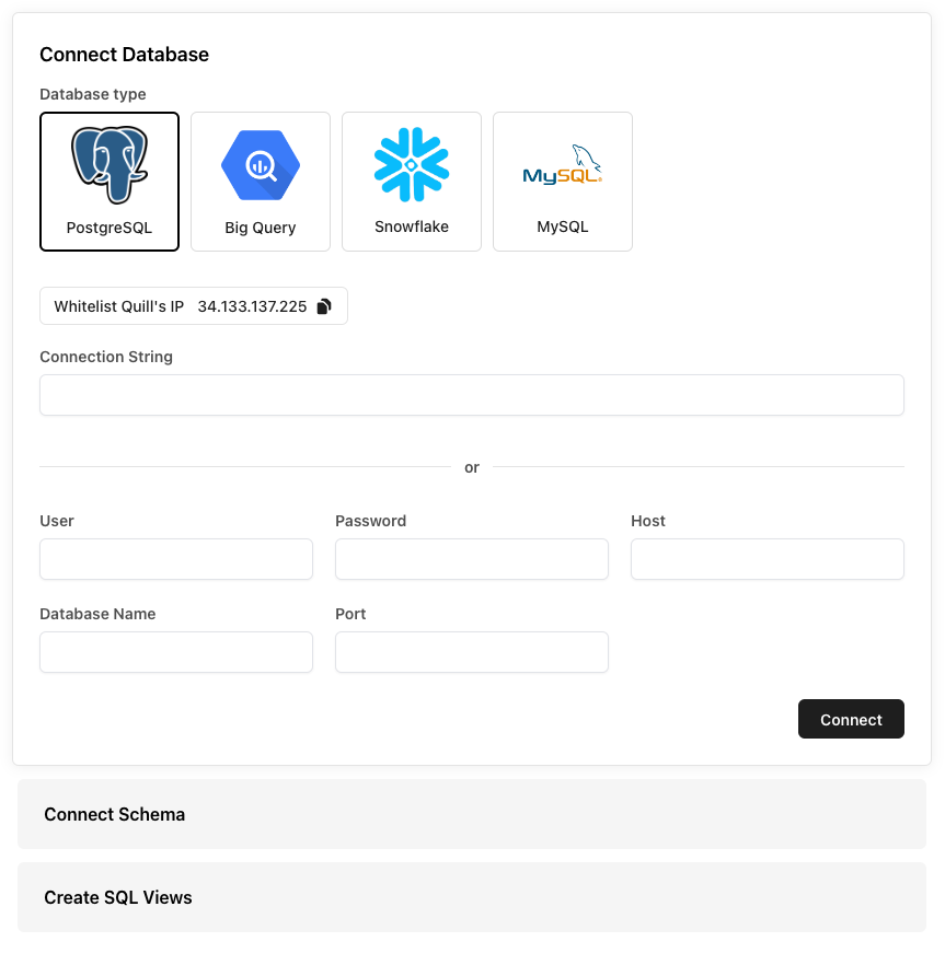 To create a read-only user in Big Query, do the following:
In the Google Cloud Console, navigate to the IAM & Admin > Service Accounts page. Click `Create Service Account` and follow the prompts to create a new service account.
Grant the `bigquery.dataViewer` role to the service account for a dataset. You can do this by navigating to the dataset’s Permissions page and adding the service account with the `bigquery.dataViewer` role.
Create a new JSON key for the service account by clicking the `Actions` dropdown next to the service account on the IAM & Admin > Service Accounts page, and then selecting `Create Key`. Select `JSON` as the key type and click `Create`. This will prompt you to save it one your local machine.
In the next step you’ll upload this JSON file into the Quill Portal.
To create a read-only user in Big Query, do the following:
In the Google Cloud Console, navigate to the IAM & Admin > Service Accounts page. Click `Create Service Account` and follow the prompts to create a new service account.
Grant the `bigquery.dataViewer` role to the service account for a dataset. You can do this by navigating to the dataset’s Permissions page and adding the service account with the `bigquery.dataViewer` role.
Create a new JSON key for the service account by clicking the `Actions` dropdown next to the service account on the IAM & Admin > Service Accounts page, and then selecting `Create Key`. Select `JSON` as the key type and click `Create`. This will prompt you to save it one your local machine.
In the next step you’ll upload this JSON file into the Quill Portal.
 To create a read-only user in Snowflake, do the following:
```SQL Snowflake SQL
-- Replace 'password' with a strong password.
CREATE USER quill_read_only PASSWORD 'password';
```
```SQL Snowflake SQL
-- Creates a role specifically for read-only access.
CREATE ROLE quill_read_only_role;
```
```SQL Snowflake SQL
-- Allows the role to read data from the tables.
GRANT SELECT ON ALL TABLES IN SCHEMA my_schema TO quill_read_only_role;
```
```SQL Snowflake SQL
-- Gives user the permissions of the role
GRANT quill_read_only_role TO quill_read_only;
```
To create a read-only user in Snowflake, do the following:
```SQL Snowflake SQL
-- Replace 'password' with a strong password.
CREATE USER quill_read_only PASSWORD 'password';
```
```SQL Snowflake SQL
-- Creates a role specifically for read-only access.
CREATE ROLE quill_read_only_role;
```
```SQL Snowflake SQL
-- Allows the role to read data from the tables.
GRANT SELECT ON ALL TABLES IN SCHEMA my_schema TO quill_read_only_role;
```
```SQL Snowflake SQL
-- Gives user the permissions of the role
GRANT quill_read_only_role TO quill_read_only;
```
 To create a read-only user in MySQL, do the following:
```SQL MySQL
-- Replace 'password' with a strong password.
CREATE USER 'quill_read_only'@'%' IDENTIFIED BY 'password';
```
```SQL MySQL
-- Allows the user to read data from the tables.
GRANT SELECT ON your_database.* TO 'quill_read_only'@'%';
```
The connection string for the read-only user we just created will be something like: `mysql://quill_read_only:password@db.example.com:3306/your_database`.
To create a read-only user in MySQL, do the following:
```SQL MySQL
-- Replace 'password' with a strong password.
CREATE USER 'quill_read_only'@'%' IDENTIFIED BY 'password';
```
```SQL MySQL
-- Allows the user to read data from the tables.
GRANT SELECT ON your_database.* TO 'quill_read_only'@'%';
```
The connection string for the read-only user we just created will be something like: `mysql://quill_read_only:password@db.example.com:3306/your_database`.
 ### 2. Connect your database
Go to [https://app.quill.co/onboard](https://app.quill.co/onboard) and enter the read-only database connection string that we created in the last step.
If you're using our fully-managed Quill instance, make sure to add the Quill
server to your database IP whitelist, if you have one. Requests from Quill
will always come from `34.133.137.225`.
For more information about data and access control, you can read our
self-hosting guide [here](/selfhost/quickstart.mdx).
### 3. Connect your schema
The Quill platform provides powerful filtering and reporting tools to help you get the insights you want, faster. Since Quill provides organization-based filtering out-of-the-box, simply let us know which table to use and Quill will automatically partition your data by organization.
### 2. Connect your database
Go to [https://app.quill.co/onboard](https://app.quill.co/onboard) and enter the read-only database connection string that we created in the last step.
If you're using our fully-managed Quill instance, make sure to add the Quill
server to your database IP whitelist, if you have one. Requests from Quill
will always come from `34.133.137.225`.
For more information about data and access control, you can read our
self-hosting guide [here](/selfhost/quickstart.mdx).
### 3. Connect your schema
The Quill platform provides powerful filtering and reporting tools to help you get the insights you want, faster. Since Quill provides organization-based filtering out-of-the-box, simply let us know which table to use and Quill will automatically partition your data by organization.
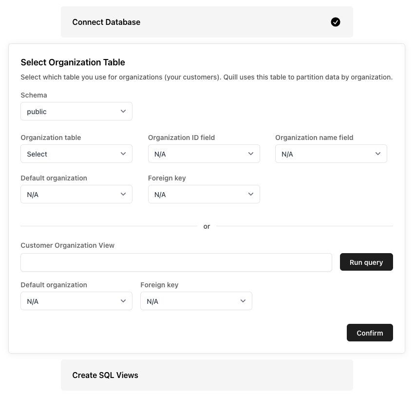 ### 4. Add SQL Views
Create a cleaned schema that makes it easier to write queries and reports. The views you create here will be used to create charts and tables later on. Don't worry, you can always create and edit these views later.
### 4. Add SQL Views
Create a cleaned schema that makes it easier to write queries and reports. The views you create here will be used to create charts and tables later on. Don't worry, you can always create and edit these views later.
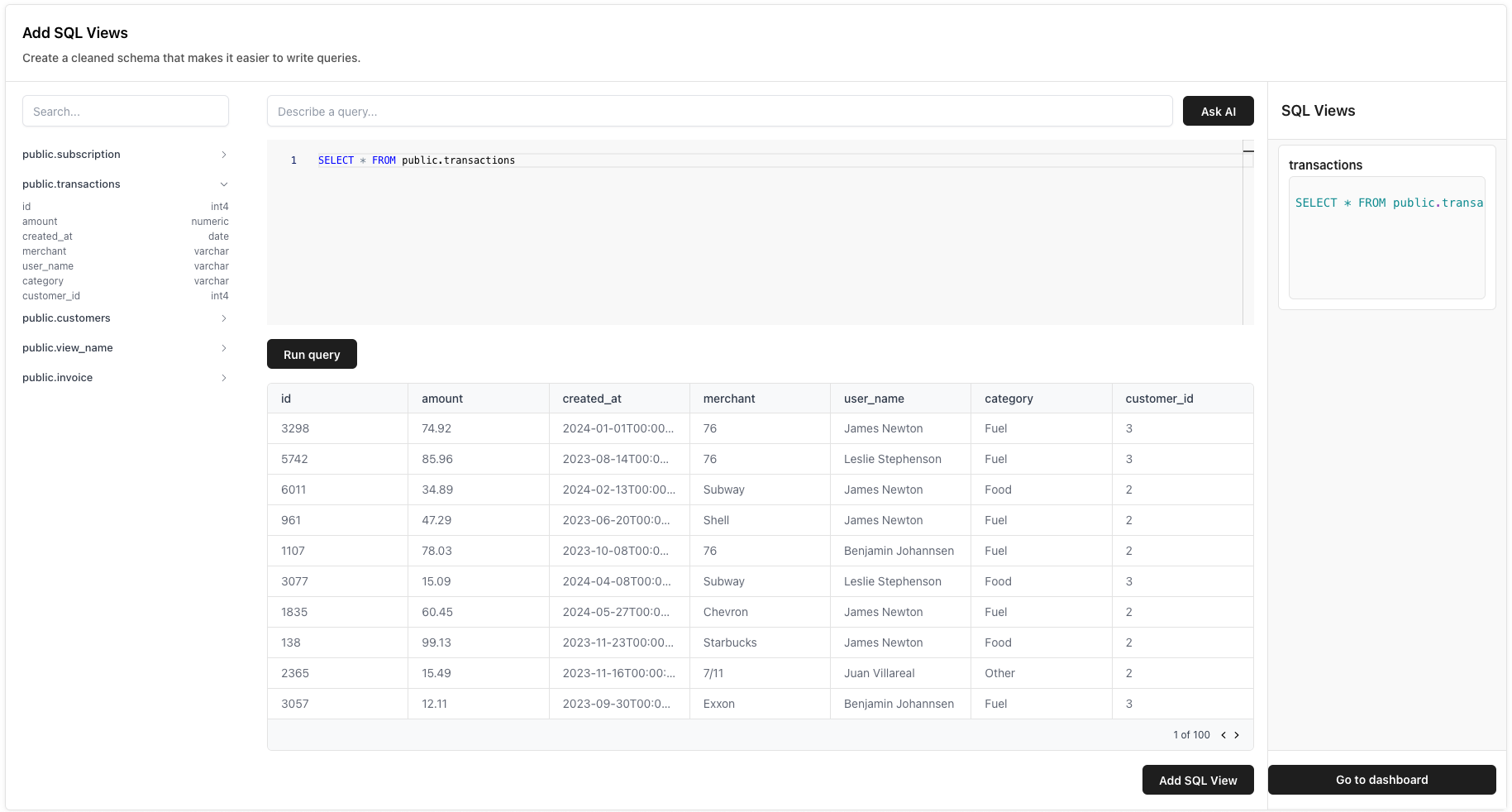 ### Next Steps
Once you have connected your database, you're ready to create your first dashboard! Check out our guides on how to create your first dashboard below.
Build your first dashboard with Quill in less than a minute.
# Create a view
Source: https://docs.quillsql.com/portal/view
Add a SQL view with Quill in less than a minute
This guide assumes you have already connected your database with Quill. If
you haven't done that yet, check out our onboarding guide
[here](/portal/quickstart).
When you first get started with the Quill platform, you only see the initial views you created in the onboarding flow.
### Next Steps
Once you have connected your database, you're ready to create your first dashboard! Check out our guides on how to create your first dashboard below.
Build your first dashboard with Quill in less than a minute.
# Create a view
Source: https://docs.quillsql.com/portal/view
Add a SQL view with Quill in less than a minute
This guide assumes you have already connected your database with Quill. If
you haven't done that yet, check out our onboarding guide
[here](/portal/quickstart).
When you first get started with the Quill platform, you only see the initial views you created in the onboarding flow.
 ### 1. Create a view
To add a new SQL view, you can click `Add view +` to open a SQL Editor that shows the visible tables that Quill can see in your schema.
SQL views can help you organize and group different data together to make it
easier to build charts and tables on top of.
### 2. Edit the view and save
Go ahead and write some SQL for a new view that you would like to create. Run the query by clicking `Run Query` and make sure the data looks correct.
### 1. Create a view
To add a new SQL view, you can click `Add view +` to open a SQL Editor that shows the visible tables that Quill can see in your schema.
SQL views can help you organize and group different data together to make it
easier to build charts and tables on top of.
### 2. Edit the view and save
Go ahead and write some SQL for a new view that you would like to create. Run the query by clicking `Run Query` and make sure the data looks correct.
 Give your new view a descriptive, clear name and then hit `Create view` to add the view to Quill. You can now query data from that view in charts and dashboards.
 ### 3. Manage your views
If you ever want to edit or delete an existing view, click on the view in the SQL Views list to open the view manager.
### 3. Manage your views
If you ever want to edit or delete an existing view, click on the view in the SQL Views list to open the view manager.
 Be careful when editing and deleting views! Make sure the charts that
reference that view are up to date so they don't get out of sync.
### Next Steps
Now that you have a view, you're ready to start using Quill! You can come back at any time and add more dashboards, charts, and views.
# Data Cache
Source: https://docs.quillsql.com/selfhost/cache
Load dashboards fast by saving frequently used queries
## 1. Install the Quill SDK
If you haven't already, start by installing the Quill Server SDK on your machine:
```bash Node.js
npm install @quillsql/node
```
```bash Python
pip3 install quillsql
```
```bash Go
go get https://github.com/quill-sql/quill-go
```
## 2. Create a cache config
To get started with the Quill data cache, you can either bring your own cache or
use our built-in cache in Quill Cloud. If you bring your own cache, you'll need
the connection info such as username, password, host, and port.
A typical redis connection string with all of the parts might look something
like this: `redis://quill_username:secret_password@example.com:12345`
Using Quill Cloud is the easiest way to get started with Quill. Reach out to
our team and ask about the Quill data cache to get started.
Make sure to add the Quill server to your database IP whitelist, if you
have one. Requests from Quill will always come from `34.133.137.225`
```mermaid
flowchart LR
subgraph yourdomain.com
db[(Database)]
end
subgraph api.quill.co
direction LR
sdk(Quill SDK)
sdk <--> redis(Cache)
end
web(User) <--> |GET api.quill.co/quill|sdk
sdk <--> yourdomain.com
```
With Self-Hosted Quill, your data never leaves your servers. Our code runs
on your machines either in your cloud or on-premise.
We operate the connected cache in a cache-aside manner which gives great
performance in read-heavy situations.
```mermaid
flowchart LR
subgraph yourdomain.com
direction LR
sdk(Quill SDK)
sdk <--> redis(Cache)
sdk <--> db[(Database)]
end
web(User) <--> |GET yourdomain.com/quill|sdk
```
## 3. Pass cache to Quill SDK
```js Node
import { Quill } from "@quillsql/node";
const quill = new Quill({
privateKey: process.env.QULL_PRIVATE_KEY,
databaseConnectionString: process.env.POSTGRES_READ,
databaseType: "postgresql",
// Just pass a cache config to the Quill instance:
cache: {
username: process.env.REDIS_USERNAME,
password: process.env.REDIS_PASSWORD,
host: process.env.REDIS_HOST,
port: process.env.REDIS_PORT,
cacheType: "redis", // or 'rediss' if SSL encrypted
},
});
```
```python Python
from quillsql import Quill
quill = Quill(
private_key=os.environ.get("QUILL_PRIVATE_KEY"),
database_connection_string=os.environ.get("POSTGRES_READ"),
# Just pass a cache config to the Quill instance:
cache={
"username": os.environ.get("REDIS_USERNAME"),
"password": os.environ.get("REDIS_PASSWORD"),
"host": os.environ.get("REDIS_HOST"),
"port": os.environ.get("REDIS_PORT"),
"cacheType": "redis", # or 'rediss' if SSL encrypted
}
)
```
Then you're done! When Quill detects a valid cache configuration it will start
using the cache provided to speed up frequently used queries.
# Quickstart
Source: https://docs.quillsql.com/selfhost/quickstart
Get up and running with Quill on your own server in 10 minutes
## 1. Install the Quill SDK
```bash Node.js
npm install @quillsql/node
```
```bash Python
pip3 install quillsql
```
```bash Go
go get https://github.com/quill-sql/quill-go
```
```bash PHP
composer require quill.co/quill-php
```
## 2. Create a new endpoint
Instantiate `Quill` with your credentials and add the below `POST` endpoint.
This example assumes you have an organization id on the user returned by your
auth middleware. Queries will not work properly without the organization id.
```js Node
import { Quill } from "@quillsql/node";
const quill = new Quill({
privateKey: process.env.QULL_PRIVATE_KEY,
databaseConnectionString: process.env.POSTGRES_READ,
databaseType: "postgresql",
});
// "authenticateJWT" is your own pre-existing auth middleware
app.post("/quill", authenticateJWT, async (req, res) => {
// assuming user fetched via auth middleware has an userId
const { userId } = req.user;
const { metadata } = req.body;
const result = await quill.query({
tenants: [{ tenantField: "user_id", tenantIds: [userId] }]
metadata,
});
res.send(result);
});
```
```python Python
from quillsql import Quill
quill = Quill(
private_key=os.environ.get("QUILL_PRIVATE_KEY"),
database_connection_string=os.environ.get("POSTGRES_READ")
)
# POST endpoint you create for Quill
@app.route('/quill', methods=['POST'])
# "token_required" is your own pre-existing auth middleware
@token_required
def quill_endpoint():
data = request.json
# assuming current user comes from existing auth
# org_id is the id on the organizations table that you
# use with Quill (ex: organizations, businesses, companies, stores etc)
return quill.query(current_user.org_id, data)
```
```go Go
import (
"github.com/quill-sql/quill-go"
)
client := quill.NewClient(quill.ClientParams{
PrivateKey: os.Getenv("QUILL_PRIVATE_KEY"),
DatabaseConnectionString: os.Getenv("POSTGRES_READ")
})
// Add an endpoint
http.HandleFunc("/quill", func(w http.ResponseWriter, r *http.Request) {
// fetch organizationID from your existing auth middleware
organizationID, _ := r.Context().Value(OrganizationIDContextKey).(string)
// Convert json body.metadata to RequestMetadata
body := &quill.RequestBody{}
err := json.NewDecoder(r.Body).Decode(body)
if err != nil {
http.Error(w, err.Error(), http.StatusBadRequest)
return
}
result, err := client.Query(organizationID, body.Metadata)
if err != nil {
http.Error(w, err.Error(), http.StatusBadRequest)
return
}
w.Header().Set("Content-Type", "application/json")
json.NewEncoder(w).Encode(result)
})
```
```php PHP
$data['metadata'],
'orgId' => $orgId
];
$response = $quill->query($params);
header('Content-Type: application/json');
$body = json_encode($response, JSON_PRETTY_PRINT);
echo $body;
exit;
}
```
## 3. Connect the frontend
You connect Quill to React with the `QuillProvider` component. Similar to React's `Context.Provider`, `QuillProvider` wraps your React app and places Quill Client on the context, enabling you to access it from anywhere in your component tree.
In App.js, let's wrap our React app with an `QuillProvider`. We suggest putting the `QuillProvider` somewhere high in your app, above any component that might need to access Quill data.
```js App.js
import { QuillProvider } from "@quillsql/react";
import Routes from "./Routes";
import UserContext from "./UserContext";
function App() {
// Use your existing auth and user context
const [user] = useContext(UserContext);
return (
);
}
```
See the `QuillProvider` [API docs](/components/quill-provider) for more
information.
Be careful when editing and deleting views! Make sure the charts that
reference that view are up to date so they don't get out of sync.
### Next Steps
Now that you have a view, you're ready to start using Quill! You can come back at any time and add more dashboards, charts, and views.
# Data Cache
Source: https://docs.quillsql.com/selfhost/cache
Load dashboards fast by saving frequently used queries
## 1. Install the Quill SDK
If you haven't already, start by installing the Quill Server SDK on your machine:
```bash Node.js
npm install @quillsql/node
```
```bash Python
pip3 install quillsql
```
```bash Go
go get https://github.com/quill-sql/quill-go
```
## 2. Create a cache config
To get started with the Quill data cache, you can either bring your own cache or
use our built-in cache in Quill Cloud. If you bring your own cache, you'll need
the connection info such as username, password, host, and port.
A typical redis connection string with all of the parts might look something
like this: `redis://quill_username:secret_password@example.com:12345`
Using Quill Cloud is the easiest way to get started with Quill. Reach out to
our team and ask about the Quill data cache to get started.
Make sure to add the Quill server to your database IP whitelist, if you
have one. Requests from Quill will always come from `34.133.137.225`
```mermaid
flowchart LR
subgraph yourdomain.com
db[(Database)]
end
subgraph api.quill.co
direction LR
sdk(Quill SDK)
sdk <--> redis(Cache)
end
web(User) <--> |GET api.quill.co/quill|sdk
sdk <--> yourdomain.com
```
With Self-Hosted Quill, your data never leaves your servers. Our code runs
on your machines either in your cloud or on-premise.
We operate the connected cache in a cache-aside manner which gives great
performance in read-heavy situations.
```mermaid
flowchart LR
subgraph yourdomain.com
direction LR
sdk(Quill SDK)
sdk <--> redis(Cache)
sdk <--> db[(Database)]
end
web(User) <--> |GET yourdomain.com/quill|sdk
```
## 3. Pass cache to Quill SDK
```js Node
import { Quill } from "@quillsql/node";
const quill = new Quill({
privateKey: process.env.QULL_PRIVATE_KEY,
databaseConnectionString: process.env.POSTGRES_READ,
databaseType: "postgresql",
// Just pass a cache config to the Quill instance:
cache: {
username: process.env.REDIS_USERNAME,
password: process.env.REDIS_PASSWORD,
host: process.env.REDIS_HOST,
port: process.env.REDIS_PORT,
cacheType: "redis", // or 'rediss' if SSL encrypted
},
});
```
```python Python
from quillsql import Quill
quill = Quill(
private_key=os.environ.get("QUILL_PRIVATE_KEY"),
database_connection_string=os.environ.get("POSTGRES_READ"),
# Just pass a cache config to the Quill instance:
cache={
"username": os.environ.get("REDIS_USERNAME"),
"password": os.environ.get("REDIS_PASSWORD"),
"host": os.environ.get("REDIS_HOST"),
"port": os.environ.get("REDIS_PORT"),
"cacheType": "redis", # or 'rediss' if SSL encrypted
}
)
```
Then you're done! When Quill detects a valid cache configuration it will start
using the cache provided to speed up frequently used queries.
# Quickstart
Source: https://docs.quillsql.com/selfhost/quickstart
Get up and running with Quill on your own server in 10 minutes
## 1. Install the Quill SDK
```bash Node.js
npm install @quillsql/node
```
```bash Python
pip3 install quillsql
```
```bash Go
go get https://github.com/quill-sql/quill-go
```
```bash PHP
composer require quill.co/quill-php
```
## 2. Create a new endpoint
Instantiate `Quill` with your credentials and add the below `POST` endpoint.
This example assumes you have an organization id on the user returned by your
auth middleware. Queries will not work properly without the organization id.
```js Node
import { Quill } from "@quillsql/node";
const quill = new Quill({
privateKey: process.env.QULL_PRIVATE_KEY,
databaseConnectionString: process.env.POSTGRES_READ,
databaseType: "postgresql",
});
// "authenticateJWT" is your own pre-existing auth middleware
app.post("/quill", authenticateJWT, async (req, res) => {
// assuming user fetched via auth middleware has an userId
const { userId } = req.user;
const { metadata } = req.body;
const result = await quill.query({
tenants: [{ tenantField: "user_id", tenantIds: [userId] }]
metadata,
});
res.send(result);
});
```
```python Python
from quillsql import Quill
quill = Quill(
private_key=os.environ.get("QUILL_PRIVATE_KEY"),
database_connection_string=os.environ.get("POSTGRES_READ")
)
# POST endpoint you create for Quill
@app.route('/quill', methods=['POST'])
# "token_required" is your own pre-existing auth middleware
@token_required
def quill_endpoint():
data = request.json
# assuming current user comes from existing auth
# org_id is the id on the organizations table that you
# use with Quill (ex: organizations, businesses, companies, stores etc)
return quill.query(current_user.org_id, data)
```
```go Go
import (
"github.com/quill-sql/quill-go"
)
client := quill.NewClient(quill.ClientParams{
PrivateKey: os.Getenv("QUILL_PRIVATE_KEY"),
DatabaseConnectionString: os.Getenv("POSTGRES_READ")
})
// Add an endpoint
http.HandleFunc("/quill", func(w http.ResponseWriter, r *http.Request) {
// fetch organizationID from your existing auth middleware
organizationID, _ := r.Context().Value(OrganizationIDContextKey).(string)
// Convert json body.metadata to RequestMetadata
body := &quill.RequestBody{}
err := json.NewDecoder(r.Body).Decode(body)
if err != nil {
http.Error(w, err.Error(), http.StatusBadRequest)
return
}
result, err := client.Query(organizationID, body.Metadata)
if err != nil {
http.Error(w, err.Error(), http.StatusBadRequest)
return
}
w.Header().Set("Content-Type", "application/json")
json.NewEncoder(w).Encode(result)
})
```
```php PHP
$data['metadata'],
'orgId' => $orgId
];
$response = $quill->query($params);
header('Content-Type: application/json');
$body = json_encode($response, JSON_PRETTY_PRINT);
echo $body;
exit;
}
```
## 3. Connect the frontend
You connect Quill to React with the `QuillProvider` component. Similar to React's `Context.Provider`, `QuillProvider` wraps your React app and places Quill Client on the context, enabling you to access it from anywhere in your component tree.
In App.js, let's wrap our React app with an `QuillProvider`. We suggest putting the `QuillProvider` somewhere high in your app, above any component that might need to access Quill data.
```js App.js
import { QuillProvider } from "@quillsql/react";
import Routes from "./Routes";
import UserContext from "./UserContext";
function App() {
// Use your existing auth and user context
const [user] = useContext(UserContext);
return (
);
}
```
See the `QuillProvider` [API docs](/components/quill-provider) for more
information.